1")
- Core idea: Emojis are “digital body language” that can add tone and stop the scroll, but they can also leak credibility if misused.
- Psychology: One emoji can act like a visual stop sign and set an emotional prime, but it can trigger “juvenile bias” in high-gravitas roles.
- Technical reality: Emojis do not count as keywords, can break legacy ATS exports, and can annoy screen readers if repeated.
- Industry matrix: Green zones can benefit, yellow zones need functional symbols only, red zones should avoid emojis entirely.
- Rules to stay safe: Use one emoji max at the start, never replace a hard keyword with an emoji, and test how it renders on Windows and mobile.
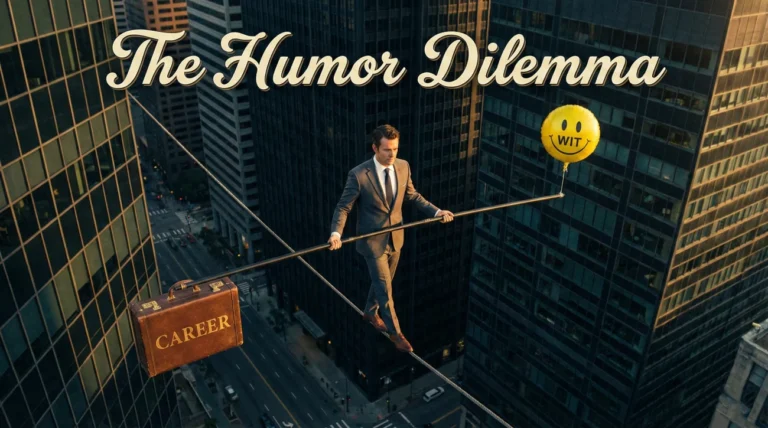
Digital Body Language: The Strategic Semiotics of Emojis
In the austere days of LinkedIn’s past, the platform was essentially a digitized rolodex – a sterile repository of CVs where professionalism was synonymous with plain text and grey suits. Today, LinkedIn has evolved into a dynamic creator economy and a hyper-active talent marketplace. In this new ecosystem, the question of should I use emojis in LinkedIn headline has shifted from a stylistic debate to a strategic one.
This is not merely about decoration. It is about Digital Body Language. In face-to-face interactions, we rely on micro-expressions, hand gestures, and tone of voice to build rapport and signal intent. In the text-heavy environment of LinkedIn, those signals are stripped away. Emojis have emerged as the “tone indicators” of the digital age – a way to reclaim nuance and inject humanity into a flat interface.
However, this tool is double-edged. Used correctly, an emoji is a powerful “Pattern Interrupt” that arrests the scrolling eye and signals modern fluency. Used incorrectly, it is a “Credibility Leak” that signals immaturity or a lack of professional gravity. This comprehensive guide moves beyond subjective preference to analyze the neuro-psychology, the technical SEO implications, and the industry-specific codes that dictate whether a 🚀 (Rocket) propels your career forward or crashes your reputation.
The Neuro-Psychology of the Scroll
 2")
To understand why emojis work (and why they sometimes fail), we must first understand the cognitive state of your audience: the Recruiter.
1. The Science of Pattern Interruption
Recruiters often suffer from “Cognitive Drift.” After scanning 50 text-heavy profiles in a row, their brains slip into an autopilot mode known as habituation. Text begins to blur together. In this state, the brain is actively seeking a novelty signal to re-engage attention.
An emoji acts as a Visual Stop Sign. Because the human brain processes images approximately 60,000 times faster than text, a colored icon registers in the visual cortex milliseconds before the linguistic center processes the words. Strategically placing an emoji at the start of your headline forces a micro-pause in the recruiter’s scanning cadence, buying you a fraction of a second of undivided attention. In the attention economy, that fraction of a second is currency.
2. Emotional Contagion & Tone
Text is notoriously bad at conveying emotion. A headline like “Project Manager driving results” can be read as confident, aggressive, or robotic depending on the reader’s mood. Emojis act as emotional conductors.
- The 🤝 (Handshake) creates a subconscious prime for partnership and agreement.
- The ⚡ (Lightning Bolt) primes the reader for speed, energy, and disruption.
- The 🎯 (Bullseye) primes the reader for precision and goal-orientation.
By controlling the emotional prime, you subtly guide how the recruiter interprets the text that follows.
3. The Juvenile Bias (The Risk)
The neuro-psychological downside is what we call the “Juvenile Bias.” For generations X and Boomers, pictorial communication was largely restricted to childhood contexts or informal settings. Seeing cartoons in a professional context can trigger a “System 1” (instinctive) assessment of immaturity. If your role requires high levels of gravitas (e.g., General Counsel, Neurosurgeon, Forensic Accountant), an emoji can trigger a subconscious devaluation of your competence before a single word is read.
The Technical Reality: SEO, ATS, and Accessibility
 3")
Beyond psychology, there are hard technical constraints that must be considered. Emojis are pieces of code, and not all systems interpret that code kindly.
1. The SEO Trade-Off (Keyword Density)
LinkedIn gives you 220 characters for your headline. Every character is precious real estate for keywords that drive search ranking.
The Math: Most emojis consume 2 characters of data, but optically take up the space of 3-4 letters.
The Risk: Emojis are not indexed as keywords. If you delete the word “SaaS” (high search volume) to make room for a 🚀 (zero search volume), you have technically hurt your SEO ranking.
The Strategy: Only use emojis if you have surplus character space. Never sacrifice a hard skill keyword for a decoration.
2. ATS Parsing Failures
While LinkedIn handles emojis well, many legacy Applicant Tracking Systems (ATS) do not. When a recruiter uses a browser extension to scrape your LinkedIn profile into their internal database, emojis can cause parsing errors.
| System Type | How It Reads Emojis | The Consequence |
|---|---|---|
| Modern ATS (Greenhouse, Lever) | Usually strips them out or displays them correctly. | Neutral / Low Risk. |
| Legacy ATS (Taleo, BrassRing) | Often converts them to “???” or “□□□”. | High Risk. Your headline becomes “??? Marketing Manager ???”. This looks like a data corruption error. |
3. Accessibility & Screen Readers
This is a critical blind spot for many. Recruiters with visual impairments use screen readers (software that reads text aloud). Screen readers translate emojis into their literal text descriptions.
- Visual: “🚀 Growth Marketer”
- Audio (Screen Reader): “Rocket Growth Marketer” (This is fine).
- Visual: “Marketing 🚀🚀🚀”
- Audio (Screen Reader): “Marketing Rocket Rocket Rocket” (This is incredibly annoying).
The Rule: Never repeat emojis. It creates an auditory nuisance that can cause a visually impaired user to skip your profile entirely.
The Industry Risk Matrix: A Sector-by-Sector Analysis
 4")
Context is the ultimate arbiter of emoji appropriateness. What signals “creativity” in one field signals “incompetence” in another. We have categorized major industries into three risk zones.
🟢 The Green Zone: High Reward / Low Risk
Industries: Digital Marketing, Social Media, Creative Design, SaaS Startups, Gen Z Consumer Brands, Coaching, Content Creation.
In these fields, being “digital native” is a job requirement. An emoji-free profile can actually signal that you are out of touch with current communication norms. Here, emojis serve as a “Tribal Signal” – proof that you speak the language of the internet.
Example:
“✨ Brand Designer | Visual Identity & UX”
Analysis: The sparkle emoji reinforces the aesthetic nature of the role. It fits the persona perfectly.
🟡 The Yellow Zone: Moderate Risk / Context Dependent
Industries: Software Engineering, Sales, Real Estate, HR / Recruiting, Mid-Market Tech, Retail Management.
Here, discretion is key. You are balancing two opposing forces: the need to stand out vs. the need to appear reliable. The strategy here is Functional Emojis – symbols that represent the tools of the trade, rather than emotional expressions.
🟢 Good Example: “🏡 Real Estate Broker | Luxury Residential” (The house is functional).
🔴 Bad Example: “🦁 Aggressive Sales Closer” (The lion is emotional and cheesy).
🔴 The Red Zone: High Risk / Negative Reward
Industries: Investment Banking, Corporate Law, C-Suite Executive (Fortune 500), Medicine (Clinical), Academia, Government, Defense.
In these sectors, authority is derived from tradition, restraint, and sobriety. An emoji signals frivolity. It suggests you do not understand the gravity of your position. If you are handling millions of dollars or human lives, “cute” is not a brand attribute you want.
The Verdict: Zero Emojis. Your authority comes from your credentials (MD, JD, CPA) and your institution names, not your decorations.
The Generational Decoder: Avoiding Semantic Traps
 5")
One of the biggest dangers of emojis is that they mean different things to different generations. A symbol you think is friendly might be interpreted as passive-aggressive by a younger hiring manager, or baffling by an older one.
| Emoji | Boomer / Gen X Interpretation | Gen Z / Millennial Interpretation | Verdict |
|---|---|---|---|
| 🙂 (Slightly Smiling Face) | “Friendly,” “Polite,” “Happy.” | “Passive-aggressive,” “Patronizing,” “I hate you but I’m smiling.” | AVOID. High risk of misinterpretation. |
| 👍 (Thumbs Up) | “Good job,” “Agreed.” | “Dismissive,” “Conversation over,” “Boomer energy.” | AVOID. Use text for confirmation instead. |
| 🔥 (Fire) | “Burning,” “Danger,” or confusion. | “Trending,” “High performace,” “Exciting.” | USE WITH CAUTION. Only in startups/tech. |
| 😎 (Sunglasses) | “Cool guy,” “Relaxed.” | “Cringe,” “Trying too hard.” | AVOID. Looks unprofessional to almost everyone now. |
The Rules of Engagement: Strategic Deployment
If you have assessed the risks and decided to proceed, follow these strict rules to maintain professional integrity.
Rule 1: The Bookend Principle (Processing Fluency)
Never place an emoji in the middle of a sentence or between keywords. It breaks the reader’s “Processing Fluency.”
Bad: “Marketing 💥 Manager helping 🚀 Startups grow” – The eye has to jump over obstacles to read the title.
Good: “🚀 Marketing Manager | B2B SaaS Growth Strategy” – The emoji acts as an initial bullet point.
Rule 2: The “One and Done” Limit
One emoji is a highlight. Two is a crowd. Three is a carnival. Using multiple emojis creates visual clutter that looks spammy and triggers the “Juvenile Bias.” Restrict yourself to a single, high-impact icon that defines your brand archetype.
Rule 3: The Multi-Device Rendering Test
Emojis are not images; they are code points interpreted by the operating system.
• On an iPhone (iOS), emojis look glossy, 3D, and high-definition.
• On Windows 10/11, they often look flat, 2D, and have thick black outlines.
• On older Androids, they can look like amorphous blobs.
Action: Always check your headline on a standard Windows desktop before finalizing. That sleek design might look clunky to a recruiter using a corporate PC.
The “Safe List”: Professional-Grade Emojis
If you must use them, stick to this curated list of “Safe” symbols that generally maintain professional integrity across platforms.
- 🚀 The Rocket: The universal symbol for startups, growth, and acceleration. Safe for Tech/Marketing. Code for “I make things go up.”
- 💻 The Laptop: Safe for Developers, IT, and Remote Workers. Signals “Digital Native.”
- 📊 The Bar Chart: Excellent for Analysts, Sales, and Marketers focusing on ROI. Signals “Data-Driven.”
- 🌍 The Globe: Perfect for Remote, International Business, or Supply Chain roles. Signals “Global Mindset.”
- 🎯 The Bullseye: Good for Sales, Strategy, and Goal-Oriented roles. Signals “Precision.”
- ⚡ The Lightning Bolt: Signals energy, electrical engineering, or “disruptive” speed. Good for Impact roles.
- 🔗 The Link: Useful for connecting ideas or supply chains. Signals “Connector.”
❓ FAQ: Advanced Emoji Strategy
🎨 Can I use colored bullet points instead of pictures?
Yes, this is the “Golden Middle.” If you find picture emojis (like rockets) too informal but want the visual separation, use geometric shapes.
Examples: 🔹 ◼️ ▶️ 💠
These act as visual separators that organize your content without carrying the semantic baggage of a cartoon. They are safe for “Yellow Zone” industries like Real Estate, Corporate Sales, or Consulting.
👔 I am a CEO/Founder. Does this apply to me?
📉 Will emojis hurt my analytics/views?
It is a trade-off. CTR (Click Through Rate) vs. Search Volume.
• Emojis often increase CTR because your profile stands out visually in a list of 10 candidates.
• However, if you sacrificed a keyword to fit the emoji, your Search Appearances might drop slightly.
Strategy: If you are already ranking well, add an emoji to boost clicks. If you are struggling to be found, delete the emoji and add more keywords.
🤖 What about “Personal Branding” emojis like 🦄 (Unicorn)?
Final Thoughts: Intentionality is the Only Rule
The decision to use an emoji should never be impulsive. It is a calculated branding move, a piece of strategic communication as potent as your profile picture or your summary. Ask yourself: “Does this symbol clarify my value, or does it distract from it?”
If you are in a conservative field, let your credentials be your visual anchor. If you are in a creative field, let an emoji be the flag that signals your tribe. But remember: An emoji is the seasoning, not the steak. No amount of 🚀 emojis can fix a headline that lacks clear positioning, strong keywords, and a compelling value proposition.
To see examples of how top professionals balance creativity with professionalism, explore our library of headline examples. For a broader strategy on optimizing your profile text, read our LinkedIn Headline Guide.
If you like practical, no-fluff advice like this, you’ll find more of it on our blog.