- Banner Leverage: Your LinkedIn banner is the biggest visual on your profile, so it shapes the first impression before anyone reads your headline.
- Safe Zone Rules: Design for a 1584×396 banner, keep key text away from the left “dead zone”, and treat the right side as the most reliable area across devices.
- Color Signals: Choose a palette that matches the story you want to project, because colors quietly imply trust, authority, energy, or warmth.
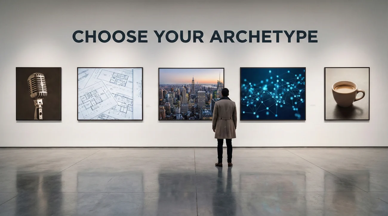
- Archetype Match: Pick a visual style that fits your role, for example authority, builder, corporate, data-focused, or human connector.
- Quality Check: Run a quick audit for crisp resolution, mobile readability, low clutter, and relevance, so your banner looks intentional not default.
The Prime Real Estate: Treating Your LinkedIn Banner as a Billion-Dollar Billboard
Your LinkedIn banner is the largest visual element on your profile. It occupies 25% of the screen real estate when someone lands on your page. Yet, 60% of users leave it as the default gray/blue geometric pattern provided by LinkedIn. This is the digital equivalent of renting a storefront on Fifth Avenue and boarding up the windows.
Visuals process in the human brain 60,000 times faster than text. Before a recruiter reads your headline, and long before they read your About section, they have already judged you based on your banner. A pixelated, stretched, or generic banner screams “lack of attention to detail.” A strategic, polished banner screams “Premium Professional.”
This comprehensive guide moves beyond “pick a nice photo.” We will explore the science of visual positioning. We will teach you how to navigate the “Dead Zones” where profile pictures hide your text, how to use Color Psychology to influence perception, and how to select a Visual Archetype that aligns perfectly with your text headline. Whether you are a creative director or a forensic accountant, your banner must tell a story.
The “Dead Zone” Protocol: Technical Mastery of the Crop
The number one mistake professionals make is designing a beautiful banner on a desktop monitor, only to realize it looks like a disaster on a smartphone. LinkedIn’s responsive design is ruthless. You must design for the “Safe Zone.”
The Non-Negotiables
- Dimensions: 1584 x 396 pixels (4:1 Aspect Ratio).
- File Type: JPG or PNG (PNG is better for text sharpness).
- File Size: Under 8MB.
Mapping the “Safe Zone”
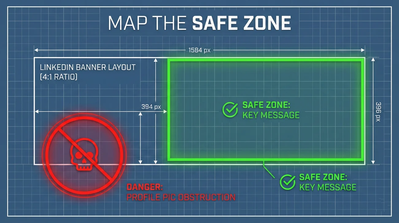
Imagine your banner is a grid.
The Left Danger Zone: On Desktop, your profile picture (Headshot) floats on the left side, covering about 20% of the banner height. On Mobile, it moves closer to the center-left. Never put text or logos in the bottom-left corner.
The Top/Bottom Trim: LinkedIn often crops a few pixels from the top and bottom depending on the browser. Keep critical info vertically centered.
Strategic Tip: Treat the right-hand side (the 50% on the right) as your “CTA Area.” This is the only space that is guaranteed to be visible and unobstructed on all devices.
Color Psychology 2.0: What Your Hex Code Says About You
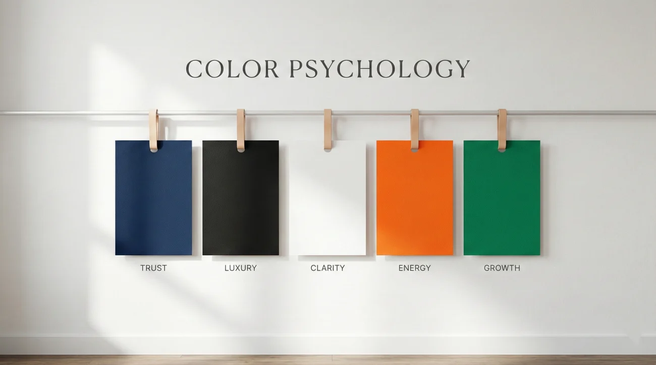
Colors are not just decoration; they are emotional cues. Choosing the wrong palette can create dissonance with your personal brand.
| Color Family | Psychological Signal | Best Industries |
|---|---|---|
| Deep Blue / Navy | Trust, Stability, Logic, Authority. | Finance, Law, Consulting, Enterprise Tech. |
| Black / Dark Grey | Luxury, Sophistication, Modernity, Power. | Architecture, High-End Real Estate, Executive Leadership. |
| White / Minimalist | Clarity, Cleanliness, Transparency. | Design, SaaS, Medical, Organizing. |
| Orange / Yellow | Energy, Innovation, Optimism, Disruption. | Startups, Marketing, Creative, Sales. |
| Green | Growth, Balance, Wealth, Health. | FinTech, Healthcare, Sustainability, Coaching. |
Pro Tip: If your company has a brand kit, use their secondary colors. It shows alignment without looking like a corporate bot.
The 5 Visual Archetypes: Defining Your Vibe
Don’t just pick a “pretty image.” Pick an archetype that matches the persona you established in your headline.
1️⃣ The Authority (Speaker/Leader)
1. The Authority (Speaker/Leader)
The Visual: A photo of you speaking on stage, holding a microphone, or leading a workshop. The background is blurred audience members or stage lights.
Best For: Consultants, C-Suite Executives, Keynote Speakers, Thought Leaders.
The Signal: “People listen to me. I am an expert.”
2️⃣ The Builder (The “In Action” Shot)
2. The Builder (The “In Action” Shot)
The Visual: A desk setup with code on screens, architectural blueprints, a camera lens, or a chaotic whiteboard session.
Best For: Developers, Engineers, Designers, Architects, PMs.
The Signal: “I do the deep work. I build things.”
3️⃣ The Corporate Partner (Skyline/Abstract)
3. The Corporate Partner (Skyline/Abstract)
The Visual: A sleek city skyline (relevant to your market), a glass office building, or a high-end geometric abstract pattern in corporate blue/grey.
Best For: Lawyers, Bankers, Sales Directors, Real Estate Agents.
The Signal: “I am professional, established, and part of the global economy.”
4️⃣ The Data Viz (Tech/Analyst)
4. The Data Viz (Tech/Analyst)
The Visual: Network nodes, data constellations, subtle matrix lines, or circuit board aesthetics. Clean, futuristic, structured.
Best For: Data Scientists, Cybersecurity, AI Engineers, Blockchain.
The Signal: “I understand complex systems and the future.”
5️⃣ The Human Connector (Warmth)
5. The Human Connector (Warmth)
The Visual: Coffee shop textures, wood grain, plants, warm lighting, or a team huddle photo.
Best For: HR, Recruiters, Coaches, Therapists, Customer Success.
The Signal: “I am approachable, empathetic, and people-focused.”
Tools of the Trade: Designing for Non-Designers
You do not need to be a graphic designer. You just need the right tools.
1. Canva (The Gold Standard)
Search for “LinkedIn Banner.” Use their templates but delete the clutter. Most templates are too busy. Remove decorative squiggles. Keep the text and the background.
2. Unsplash / Pexels (Free Stock Photos)
Search for “Abstract Tech,” “Minimalist Office,” or “Architecture.”
Warning: Do not use the first result. Everyone uses it. Scroll down to page 5 to find something unique.
3. Remove.bg
If you want to put your own photo or a logo on the banner, use this tool to strip the background instantly. Transparent PNGs look professional; white boxes around logos look amateur.
4. Figma (For the Pros)
If you want exact pixel control, use Figma. It allows you to create a “Frame” of exactly 1584×396 so you can see exactly where the crop happens.
The 10-Point Visual Audit Scorecard
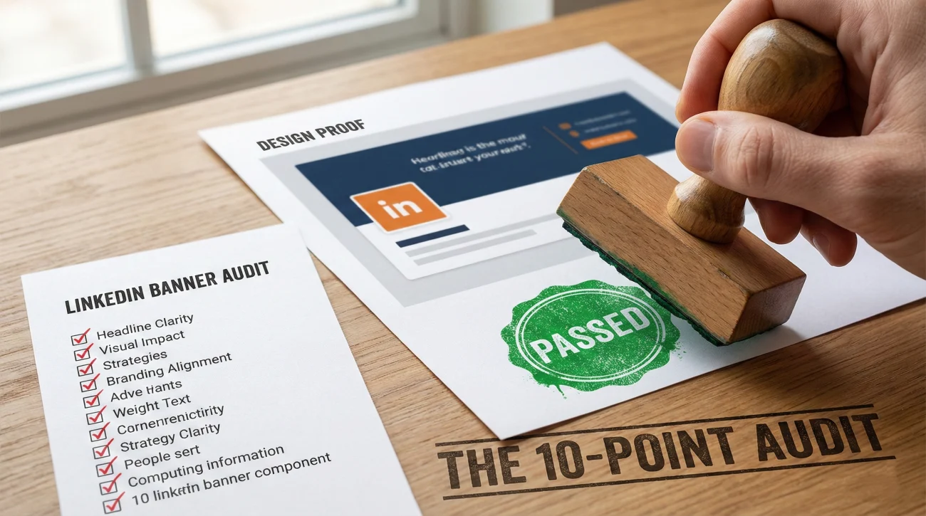
Before you upload, grade your banner. Target score: 8/10.
- Resolution Check: Is the image crisp? (No pixelation on large monitors).
- The Dead Zone Check: Is the bottom-left corner completely empty of text/logos?
- Mobile Check: Did I check how it looks on the LinkedIn phone app?
- Contrast Check: Is the text readable against the background? (Dark text on dark background = Fail).
- Brand Alignment: Does the color palette clash with my profile photo attire?
- Relevance: Does the image relate to my headline? (e.g., Beach photo for a Finance Director = Fail).
- Simplicity: Are there fewer than 10 words of text?
- Timeliness: Is the banner current? (No logos of companies you left 3 years ago).
- Differentiation: Is this the default LinkedIn background? (If yes, automatic Fail).
- The “Squint Test”: If you squint, does the banner still look balanced and professional?
❓ FAQ
📝 Should I put my email or phone number in the banner?
🏢 My company provided a branded banner. Should I use it?
🎨 Can I just use a solid color?
🔄 How often should I change my banner?
Final Thoughts: The Halo Effect
In psychology, the “Halo Effect” describes how one positive trait (like a polished visual appearance) influences our perception of other traits (like competence and intelligence). A high-quality banner creates a Halo Effect for your entire profile.
It tells the visitor: “I take my career seriously. I care about presentation. I am a professional.”
Don’t let 25% of your profile remain a “Dead Zone.” Claim that real estate. Design your billboard. Tell your story before you even say a word.
Ready to upgrade the rest of your profile? Explore our guide on headline strategy or browse visual examples by industry.
If you like practical, no-fluff advice like this, you’ll find more of it on our blog.